
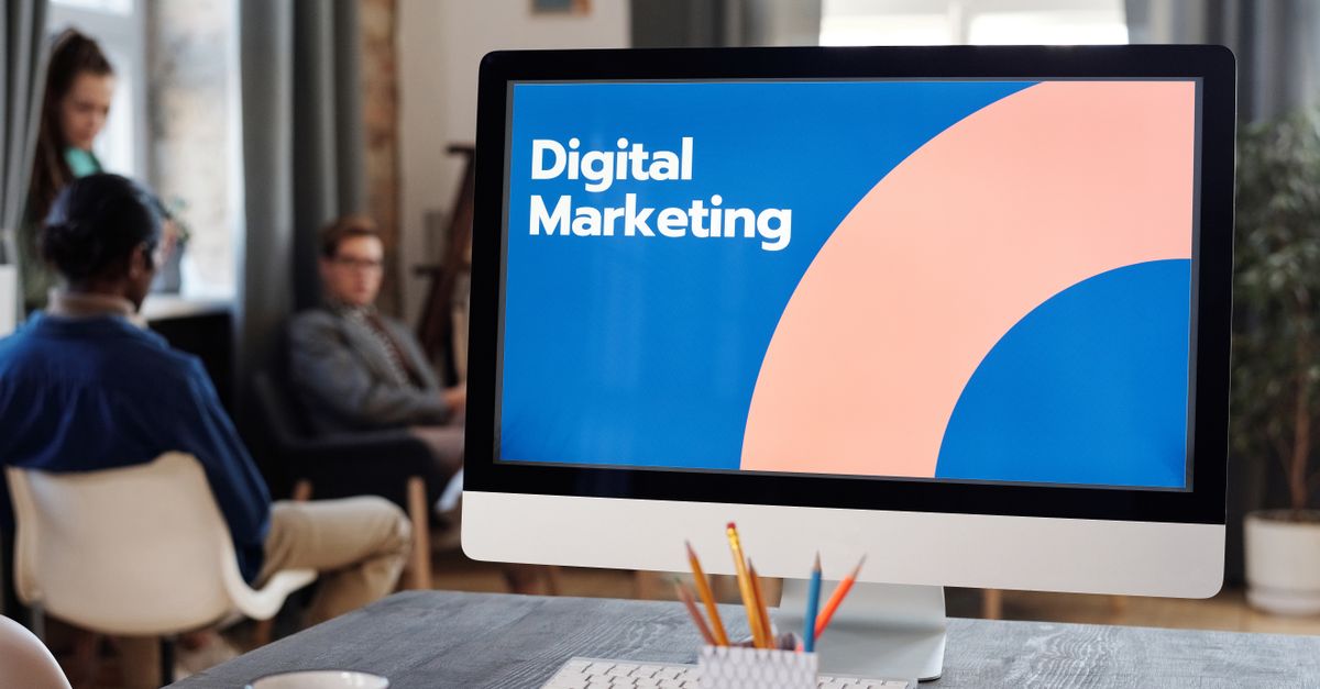
A hero image is a large, visually striking banner prominently featured at the top of a website or digital content page. Designed to immediately capture visitors’ attention, it effectively conveys the essence of a brand, product, or message. Serving as the focal point of user experience, hero images set the tone and provide a compelling visual introduction to the content below.
In web design, hero images transcend mere decoration by playing a crucial role in storytelling and brand identity. Combining high-resolution imagery with overlay text or calls-to-action, they create immersive experiences that influence user behavior and engagement. Strategically employed, hero images showcase key messages, evoke emotions, and encourage exploration, enhancing both aesthetics and functionality.
Beyond visual appeal, hero images are integral to conversion optimization and marketing strategies. They establish trust and credibility by projecting professionalism and quality. When executed effectively, a hero image not only elevates a website’s visual impact but also drives user interaction and boosts conversion rates by creating memorable, meaningful first impressions.
Impact of Hero Images on User Engagement
Take a concrete case: a service provider’s website draws around 6,000 visits each month. Swapping a generic header for a hero image relevant to their sector led to average visit duration increasing by 20 seconds, and bounce rates falling significantly. This step-by-step impact suggests a well-chosen hero image can make users pause, engage, and absorb more about a business, translating passive glances into real interactions.
Hero images act as emotional connectors, setting the tone at first glance. Compelling, relevant visuals can prompt curiosity or create trust, turning an ordinary homepage into a memorable experience—especially when tailored to local culture or specific customer segments. The first impression often dictates whether visitors choose to continue exploring or leave within seconds.
Yet, relying on bold imagery has pitfalls. Slow-loading graphics or irrelevant photos can frustrate users or erode credibility. It’s essential to select images that not only capture attention but also clearly relate to the offer or brand tone, ensuring the visual doesn’t mislead or distract.
- Strong visuals can double the time visitors spend on a homepage
- Localised images often increase emotional relevance and retention
- Hero visuals guide users’ eyes towards key calls to action
- Oversized or poorly optimised images can slow down site loading
- Consistent branding through imagery builds long-term recognition
- Images relating to seasonal trends can spark timely engagement
Best Practices for Designing Hero Images
Look at the numbers: an SME with a website driving around 7,200 monthly visits (1200 x (2+4)) can see up to 75% of users engaging with the hero image before scrolling. In this scenario, a visually strong and well-optimised hero image can be the difference between a 2% and 6% conversion rate. This highlights why investing time in image quality and clarity can have a major impact on click-throughs and leads.
Ensuring the hero image complements your message is vital. An image that clashes with your brand or site intent can confuse users or even drive them away. Test your design on multiple devices before going live. Responsive hero images can display awkwardly on mobiles if not checked, leading to lost opportunities. Be aware of distracting backgrounds, poorly chosen overlays, or illegible text. These issues can pull focus away from your main offering and reduce the effectiveness of your visual centrepiece.
- Use high-resolution, optimised files for fast load times
- Choose images directly related to your product or core service
- Keep focal points clear and avoid clutter around key content
- Overlay concise, readable copy that reinforces your message
- Check how the image displays on mobile, tablet, and large screens
- Use authentic visuals over generic stock photos where possible
Common Mistakes to Avoid with Hero Images
Overlooking image optimisation often leads to slow-loading websites, especially when a business uploads high-resolution visuals straight from a camera. This undermines the user experience and can significantly increase bounce rates. A site attracting about 8,400 monthly sessions will see a drop-off in engagement if visitors become frustrated waiting for large images to load. These unnecessary delays can translate into missed opportunities and lost revenue, making image size and proper compression critical factors.
Another frequent oversight is poor contrast between text and imagery, which hampers readability. If visitors struggle to interpret messaging on your hero image, the intended impact is lost. Similarly, using generic stock photos that do not represent your brand decreases authenticity, making your site less memorable. Failing to make the hero area visually responsive across devices further complicates navigation for mobile users.
- Using uncompressed or oversized images that slow page loading
- Overlaying text that is not easily readable against the background
- Selecting non-representative, overused stock images that lack brand personality
- Ignoring responsiveness, resulting in distorted images on mobiles or tablets
- Neglecting to test load times and accessibility for all users
- Choosing visuals irrelevant to the core offer or user intent
Hero Images Versus Other Banner Types
Run the maths on this: a site receiving 10,800 monthly visits is trialling different homepage visuals. A singular, full-width hero image anchors the page for one test month. In another, the site rotates three smaller banners above the fold. The version with the hero image yields a 16% increase in click-through to featured collections, compared to the variant with multiple banner types. This suggests that one bold, focused visual encourages clearer user pathways, while split attention with multiple banners dilutes impact.
However, it’s important to match the visual approach to your content strategy. Hero images are highly effective when you need to make a strong statement — ideal for showcasing new product launches or brand identity. By contrast, smaller banners provide flexibility for highlighting multiple promotions but can lead to a cluttered experience if overused.
| Banner Type | What to check | Risk or note |
|---|---|---|
| Full-width hero image | Central message clarity | May overpower smaller calls to action |
| Rotating banners | Relevance and frequency of rotation | Can distract or confuse visitors |
| Split banners or grids | Logical grouping and visual hierarchy | Risks inconsistent branding |
A common pitfall is using too many rotating or grid banners, causing decision fatigue. Prioritise simplicity where possible. For most sites, a hero image offers the clearest way to direct visitor attention to your most valuable offer.
