
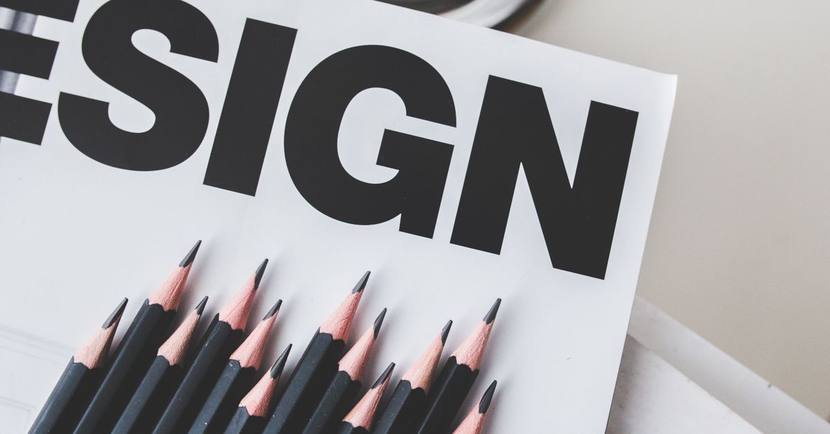
Channelgraphics refers to the visual elements and design assets used across various marketing channels to ensure a consistent and engaging brand presentation. These graphics include images, infographics, banners, icons, and other visual content tailored to each channel’s requirements. The goal is to maintain a unified look and feel that reinforces brand identity while enhancing user experience across all platforms.
Effective channelgraphics balance aesthetic appeal with functionality. They help communicate key messages efficiently and capture attention in today’s crowded digital environment. By following established brand guidelines, these visual assets create a cohesive narrative that supports marketing strategies and strengthens brand recognition.
Investing in high-quality channelgraphics is essential for building a strong digital presence. Beyond improving visual appeal, they significantly impact user engagement and conversion rates. When executed consistently, channelgraphics help brands differentiate themselves across multiple channels while maintaining a cohesive and memorable visual identity.
Core Elements of Channel Graphics
Take a concrete case: a regional retailer decides to standardise their online visuals as they expand to 6,000 digital customer interactions each month. To maintain brand consistency, they review each asset—social banners, ad images, email headers—to ensure that tone, palette and logo use are coherent. The result is not only a recognisable presence, but also a stronger brand reputation across varied platforms. It’s easy to overlook minor variations, but these can fragment brand recognition fast.
Common pitfalls include inconsistent logo sizing or uncoordinated colour schemes that reduce impact. Another risk arises when images fit poorly across different screen formats, appearing stretched or cropped. Aim to develop core brand graphic templates and test them on multiple platforms before rolling out updates. This reduces the chance of errors and builds familiarity with every customer touchpoint.
- Consistent use of logo, shapes and key brand elements
- Unified colour palette that matches brand guidelines
- Typefaces set for readability across all major devices
- Visual hierarchy to lead attention to the right message
- Scalable image quality for both mobile and desktop screens
- Adaptability for different platform aspect ratios without distortion
Balancing Brand Consistency with Channel-Specific Design
Look at the numbers: A small UK retailer prepares 7,200 monthly social media posts across varying channels, each with its own visual style, over the course of six months. To maintain a unified brand identity, they build a visual guidelines toolkit with defined colour palettes, logo usage, and typographic styles clearly set out for all team members. Despite these standards, each channel—from Instagram’s image-heavy grid to email banners—requires tailored adjustments to dimensions, contrast, and content density. By keeping signature colours and iconography constant, but optimising layouts per channel, the retailer secures recognition while supporting higher engagement.
There is always a risk that excessive adaptation can dilute brand coherence. Disparate banner crops, off-brand image filters, or using unauthorised fonts can erode customer trust. Periodic internal audits and template libraries can head off drift, ensuring everyone follows the core look and feel. The trick is to flex visuals only as much as each platform demands—enough to deliver results without weakening the overall brand perception.
- Maintain a master style guide with clear do’s and don’ts
- Adjust visual weight and spacing to suit each platform’s norms
- Use channel-specific templates for rapid, consistent adaptation
- Conduct regular visual audits across all live channels
- Train staff on both brand and channel-specific requirements
Impact on User Engagement and Conversions
A cohesive and visually appealing set of channel graphics is often a critical first step in capturing a user’s attention. People naturally respond better to strong, consistent imagery, so brands that use distinctive visual branding across their channels tend to communicate credibility and professionalism from the moment a user lands on their profile or landing page. This instant recognition lowers friction, encouraging users to stay longer and interact more frequently.
Consider an organisation averaging 8,400 monthly visits across its main channels. By updating its designs for profile images, cover banners, and post visuals, it sees the average session duration increase by 15%. Conversion enquiries rise from 2% to 3%, directly attributable to improved perception and clearer messaging. This 50% lift in conversions demonstrates how a unified visual presence can translate not just to more engagement, but also to tangible business outcomes.
Poorly designed or inconsistent graphics often lead to user confusion, reduced trust, and higher bounce rates. Small inconsistencies—like mismatched colour palettes or outdated logos—can undermine the sense of reliability needed for users to take the next step, whether that’s signing up, making contact, or purchasing.
- Ensure colours, fonts, and imagery match across all digital platforms
- Feature calls to action prominently in banners and visuals
- Update graphics regularly to avoid outdated messaging
- Optimise image resolution for faster loading and crisp appearance
- Test different graphic styles to see which affect engagement most
- Use clear, simple graphics to make key information stand out
Practical Steps for Implementing Channel Graphics
Run the maths on this: suppose a business launches a visual rebrand with updated logos and graphic templates for 12,000 website sessions per month. If these new visual elements are consistently rolled out across every key channel—website, email, and social profiles—brand recall can see a significant uptick over the following months. But overlooking just one touchpoint (such as a neglected YouTube header or out-of-date email signature) could create confusion and dilute recognition, holding back that potential increase.
The best approach is to begin with a single source of truth for all branded visuals, such as a central folder or online library. Assign responsibility for reviewing each major channel, scheduling regular audits, and making immediate updates to old assets. Revisit performance monthly, tracking metrics like engagement and direct feedback for signs of improved recognition. Taking time upfront to plan deployment saves you the frustration of cleaning up inconsistent graphics halfway through a campaign.
- Audit all digital and print channels to list every location where graphics appear
- Design or update graphic elements, keeping core colours and logo placement uniform
- Centralise assets in an accessible, version-controlled folder for your team
- Assign someone specific to deploy and cross-check updated graphics on each channel
- Communicate changes to all staff who use branded assets in customer-facing materials
- Set a recurring review date to spot and correct outdated graphics before they cause confusion
Common Pitfalls and Optimisation Tips
Here is a simple example: a medium-sized agency rolls out fresh visual branding across 5 digital channels, each of which features unique size requirements and colour settings. With around 6,300 distinct graphic uses a month, even a small inconsistency—such as mismatched logos or text overlapping a key image—can snowball into a recognisable loss in professionalism and trust. If each error takes ten minutes to identify and correct, this equates to over 1,000 hours a year spent on preventable rework, draining both time and morale.
For many teams, unclear brand guidelines and inconsistent file types are key culprits. Relying on outdated templates or neglecting accessibility considerations can further alienate portions of the audience. Reviewing channel requirements and setting up a routine audit will help spot errors before they go live. Regular reviews across platforms ensure that your visual identity remains sharp, recognisable, and functional everywhere your business appears.
- Review and update templates for all major platforms quarterly
- Assign a team member to oversee final graphic approvals
- Keep colour palettes and fonts consistent in a shared resource
- Use platform-specific previews to check image alignment and cropping
- Maintain high-resolution master files for every asset
- Factor accessibility—like contrast and text size—into every design
- Streamline feedback with a single, documented approval workflow
| Item | What to check | Risk or note |
|---|---|---|
| Template consistency | Uniform use across channels | Brand dilution if divergent |
| Image resolution | Meets minimum required for each format | Low-res assets appear unprofessional |
| Colour accuracy | Adherence to brand palette | Off-brand impressions |
| Text legibility | Contrast and size on all backgrounds | Message missed if hard to read |
| File types | Platform-compliant formats | Upload errors and compatibility issues |