
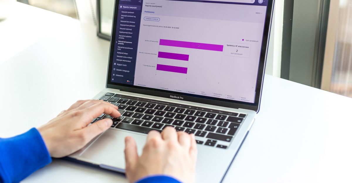
Crazy Egg is a powerful web analytics tool that offers visual insights into user behavior through heatmaps, scroll maps, and click reports. This solution enables marketers and designers to better understand visitor interactions by showing exactly where users click, how far they scroll, and which page elements attract the most attention. These visual representations provide valuable data for optimizing design and content based on actual engagement patterns.
Businesses leveraging Crazy Egg can effectively identify usability challenges, refine page layouts, and elevate the overall user experience. The platform’s robust features, including A/B testing and session recordings, allow teams to experiment with various design approaches and identify the most effective strategies for conversion optimization. This empirical approach facilitates ongoing enhancements to both website performance and customer satisfaction.
Ultimately, Crazy Egg enables organizations to base critical decisions on concrete user behavior data rather than assumptions. Its comprehensive analytics deliver actionable insights that can boost engagement metrics, increase conversion rates, and improve return on investment for digital marketing initiatives. As visual data continues to play a pivotal role in web optimization strategies, Crazy Egg maintains its position as an essential tool for online businesses.
Key Features of Crazy Egg
Take a concrete case: an SME website draws 6,000 visits every month, but conversions remain stagnant. Using visual analytics can help identify whether call-to-action buttons are too far down the page or if visitors are abandoning the site at particular points. By mapping exactly where users click and how far they scroll, businesses can target specific bottlenecks and address them with evidence-based tweaks.
Heatmaps offer a clear picture of where the majority of users interact on each page, highlighting both popular and neglected areas. Scroll maps go a step further, showing how far down the page visitors travel, which is essential to assess if key content is visible. Additionally, tools for A/B testing allow businesses to try different layouts or content, measuring which changes boost engagement or reduce bounce rates.
Businesses new to website analytics are often surprised at how quickly user patterns emerge. However, the risk is making changes based on limited data, especially if the sample size for tests is too small or data is not properly segmented. Always check that enough sessions have been monitored before acting on the insights for a more robust improvement to user experience.
- Visual heatmaps display click activity to reveal user preferences
- Scroll maps show visitor attention span and identify drop-off points
- Confetti reports break clicks down by referral sources or devices
- Recordings replay real user journeys to expose friction points
- A/B testing tools let you trial on-page changes and compare results
- Overlay reports detail individual element performance on a page
- Segmentation tools enable analysis by device, traffic source, or geography
Benefits for Website Optimisation
Look at the numbers: Imagine a Cork-based e-commerce site with 7,200 monthly sessions, looking to reduce bounce rates and boost sales. By using visual website analytics, the team identifies that users are dropping off on the basket page. After tweaking the layout, session recordings show customers moving past previous sticking points, resulting in more checkouts within just a few weeks. This direct feedback speeds up testing cycles and helps the team make changes that yield better engagement.
Website optimisation tools that offer heatmaps and click tracking give valuable perspective on how real visitors behave on your site. Instead of guessing, you can target improvements based on actual user movements, such as revising key messaging or simplifying navigation menus. While acting on insights, always remember the context—sometimes a drop in clicks means users found what they needed faster, not that they lost interest. To avoid missteps, cross-reference behaviour patterns with conversion data and segment by device or traffic source.
- Uncover exactly where users get stuck or abandon the journey
- Prioritise changes that show measurable improvements in engagement or conversions
- Reduce trial and error by relying on visual evidence of customer actions
- Tailor site layouts for mobile versus desktop users based on actual interaction data
- Test tweaks with confidence, knowing which areas have the most impact
- Make informed decisions quickly by visualising visitor flows and hotspots
Step-by-Step Example of Using Crazy Egg
Begin by installing a tracking script on your website. This involves copying a snippet of code and placing it in the header on each page you wish to analyse. Once the script is in place, you can log in to your dashboard and select a page to start tracking. Choose which visualisations to generate, such as heatmaps, scroll maps, or click reports. Within a typical month, a local service business might receive roughly 8,400 visits on a key landing page. All user interactions on this page are then recorded for visual analysis.
Review the heatmap to see which sections attract the most attention. For instance, the contact form and pricing buttons might show dense clusters of clicks, indicating high engagement. Conversely, parts of the page with little or no interaction could suggest a need for better design or repositioned elements. Next, interpret scroll maps to determine how far visitors travel down the page. If 80% of users drop off before reaching the testimonials, you may want to move them higher up.
- Make sure the tracking code is placed on every key page to avoid missing data
- Allow enough time for collecting a meaningful data sample before drawing conclusions
- Cross-reference visual map findings with analytics to confirm hypotheses about user behaviour
- Use click and scroll maps together for a fuller picture of website engagement
- Test adjustments in page layout and revisit the visualisations to measure impact
- Look out for persistent blind spots—areas never clicked—when reviewing design
- Engage team members with the visual data for collective input and better solutions
Common Challenges and Pitfalls
Run the maths on this: suppose a mid-sized business receives around 9,600 monthly sessions, and deploys visual analytics across key landing pages. With so much data coming in, there’s a risk of becoming overwhelmed and missing actionable trends. Failing to segment data by traffic source, device, or audience type can mask user behaviour patterns. Spending time on broad data rather than precise segments often leads to wasted effort and less meaningful insights.
Another issue crops up when analytics tracking isn’t configured properly. For example, if click mapping codes aren’t correctly installed, the resulting reports may leave out key interactions. This can cause decision-makers to mistrust the data, or—even worse—optimise based on flawed conclusions. Regular technical reviews and calibration with other analytics platforms can catch these mistakes early.
- Start by clearly defining goals for each test or report before tracking
- Segment reports by device, traffic source, or user type for deeper analysis
- Check installation codes after any website changes or updates
- Limit the number of page snapshots to prevent confusion and reporting clutter
- Schedule time on the calendar to regularly review and act on findings
- Use tool visualisations as a starting point, not the definitive answer to all UX decisions
FAQ on Visual Website Analytics Tools
Here is a simple example: imagine a small agency managing a website with about 8,400 monthly sessions. By deploying visual analytics tools, they can quickly spot that 70% of users drop off at a particular navigation point. Acting on this insight, they restructure the site menu, and the following month, engagement at that point rises by 40%. This shows that even basic heatmaps and click tracking can reveal immediate, actionable opportunities for website improvement.
Common pitfalls occur when teams misinterpret heatmap data, for instance, by overvaluing clicks on non-interactive elements or ignoring device differences. Before making structural changes, always compare user flows across both mobile and desktop, as behaviour can differ. Data from one month may be skewed by a campaign or season, so regular review is vital.
- Visual analytics tools track where users click, scroll, or hesitate on site pages
- Heatmaps can quickly highlight the parts of a page users find most engaging
- A/B testing features often let you compare changes before full rollout
- Device-specific reports prevent you from missing mobile or desktop-specific issues
- Session recordings may help diagnose complex or unexpected user journeys
- It’s best to combine visual insights with classic analytics for a fuller picture
- Check access controls if several team members need to review findings