
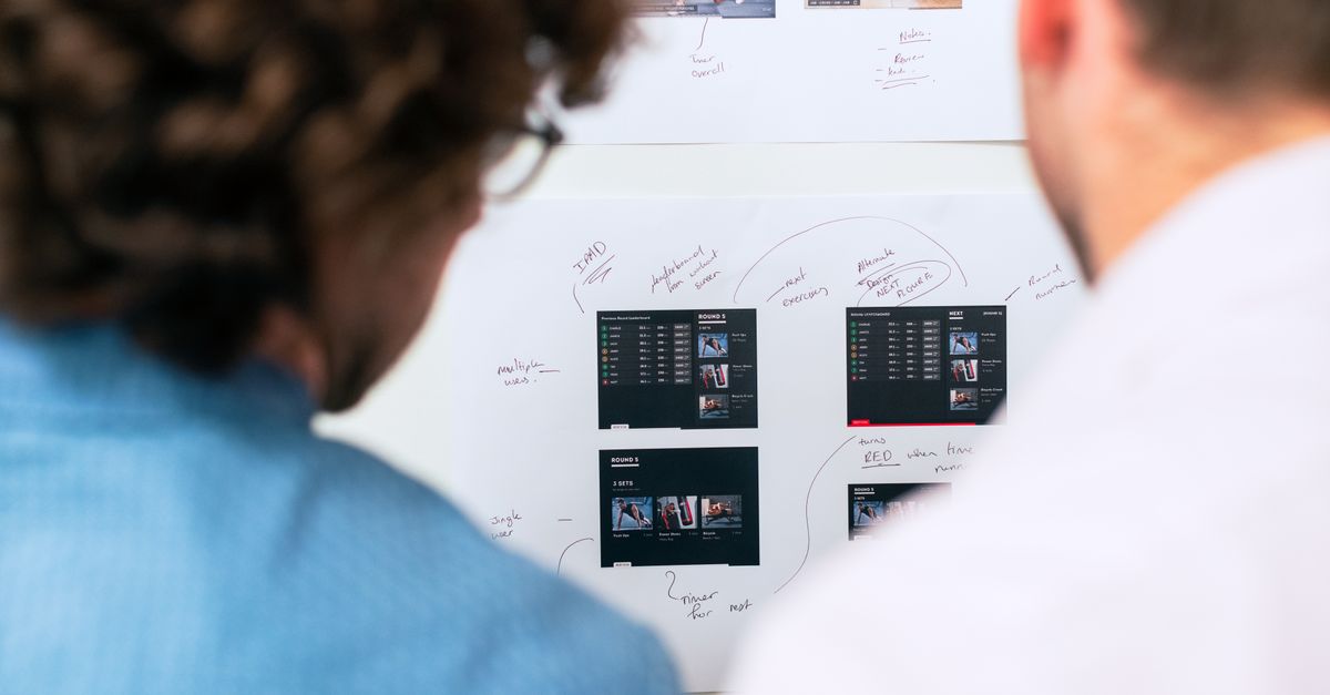
A wireframe is a visual blueprint or schematic that outlines the basic structure and layout of a webpage or application interface. It serves as an initial design tool focusing on functionality and user experience rather than aesthetics. Wireframes typically illustrate key components such as navigation menus, content areas, and interactive elements, providing a clear framework for further design and development.
The primary purpose of a wireframe is to facilitate communication between designers, developers, and stakeholders by offering a simplified visual representation of the project. This early-stage planning tool helps identify potential usability issues and allows for rapid iterations before investing in high-fidelity designs. It’s an essential step in the design process that ensures the final product meets both user needs and business objectives.
Wireframes are not meant to be final designs but rather functional guides that establish the foundation for subsequent visual and technical work. They play a crucial role in aligning teams on the project’s overall vision and structure, ensuring everyone understands the layout and information flow. As such, wireframes contribute to efficient project management and a smoother development process.
Core Functions and Benefits of Wireframes
Take a concrete case: A small agency is planning the redesign of a website expected to receive around 6,000 visits a month. By starting with a clear wireframe, the designers and stakeholders quickly agree on where major elements like the call to action, navigation, and feature highlights should appear. As a result, confusion and wasted revisions are kept to a minimum—saving valuable project hours during critical early discussions.
Wireframes act as the visual skeleton that helps teams map out key user journeys without being distracted by colour schemes or imagery. By providing a shared language for designers, marketers, and clients, they help focus conversations on structure and usability, not design details. This visual clarity makes it easier to spot potential pain points before investing time in full visual designs or coding, significantly reducing friction between stakeholders.
- Clarifies content hierarchy and layout for everyone involved
- Allows feedback early without costly design or development changes
- Highlights potential user experience issues before detailed design starts
- Saves time by making page structures quick to adapt
- Eases stakeholder communication by keeping focus on core objectives
- Makes collaborative planning more efficient and transparent
Common Wireframing Elements and Features
Look at the numbers: a busy law firm’s website wireframe is reviewed as it’s redesigned for 7,200 monthly visitors. The agency begins by marking navigation areas, header placement, content blocks, call-to-action buttons and forms. Even before colour and branding, these wireframing elements help designers visualise how users might access information and move through the site—critical steps when high traffic makes clarity crucial. This practical approach streamlines feedback from stakeholders and reduces confusion when technical teams build out the real site later.
Common risks include inconsistent spacing, absent visual hierarchy or navigation that’s hard to follow. For a site with thousands of visitors, even small structural flaws can hurt usability and conversion rates. It’s wise to check that all key touchpoints—like menus and basic contact forms—are present, and that each box or button serves a clear purpose within the wireframe.
- Navigation menus—lay out clear paths for users from page to page
- Headers—section titles or page banners that establish content structure
- Content placeholders—represent text, images, or media to show layout intent
- Call-to-action buttons—indicate where users are meant to take action
- Forms—fields for user input, such as search or contact forms
- Footers—end-of-page links or information, sometimes for legal or contact details
- Sidebars—extra information or links to supplement main content
Practical Example of a Wireframe in Use
A local Irish retail chain wants to revamp their website to better showcase their product range and improve the visitor experience. The design team begins by creating a wireframe representing an average of 8,400 monthly visitors. This blueprint focuses on arranging major elements like the hero section, product categories, navigation, contact forms, and call-to-action buttons, without the distraction of colours or graphics.
The wireframe helps clarify what content is most important and how users should flow from arrival on the homepage to making an enquiry or purchase. Through feedback sessions, the retailer’s team identifies unnecessary steps that could confuse shoppers, removing a redundant “about us” block and shifting the product search bar higher on the page. This early sketch saves hours of later rework, as the agreed structure is tested and adjusted long before visual design or code.
- Start with pencil sketches before digital tools for quicker adjustments
- Test the wireframe with 2-3 real customers for fresh insights
- Prioritise primary user actions, such as search or purchase
- Use placeholder text and boxes—don’t get distracted by imagery yet
- Only move to design after confirming every key step in the journey
Differences Between Wireframes, Mockups, and Prototypes
Run the maths on this: imagine a web project with 9,600 page views a month during the layout phase. At this stage, a wireframe acts as the foundation—quickly sketched outlines that display structure without design elements. With 9,600 sessions, stakeholders can quickly review several iterations, ensuring the basic navigation and content layout meets business objectives before committing design or development resources. In contrast, mockups deliver a polished visual, complete with colour, graphics, and font choices but lacking interactive elements.
Prototypes differ again. They simulate user interaction, enabling teams to test flows and gather feedback before launch. This means any significant usability issues uncovered at the prototype stage are less expensive to fix than if found after development. Not clarifying these distinctions can lead to wasted effort, scope creep, and unnecessary cost—all of which small businesses should avoid.
| Stage | Detail Level | Main Purpose |
|---|---|---|
| Wireframe | Low | Define structure and layout |
| Mockup | Medium | Show visual design |
| Prototype | High | Demonstrate interactivity and flows |
If you skip the wireframe or move too quickly to a prototype, you risk missing fundamental issues with layout or navigation. Make sure you invest time in each stage proportionate to your project size, and always seek early feedback.
